
The Sticky Flag Animation with Hover Effect


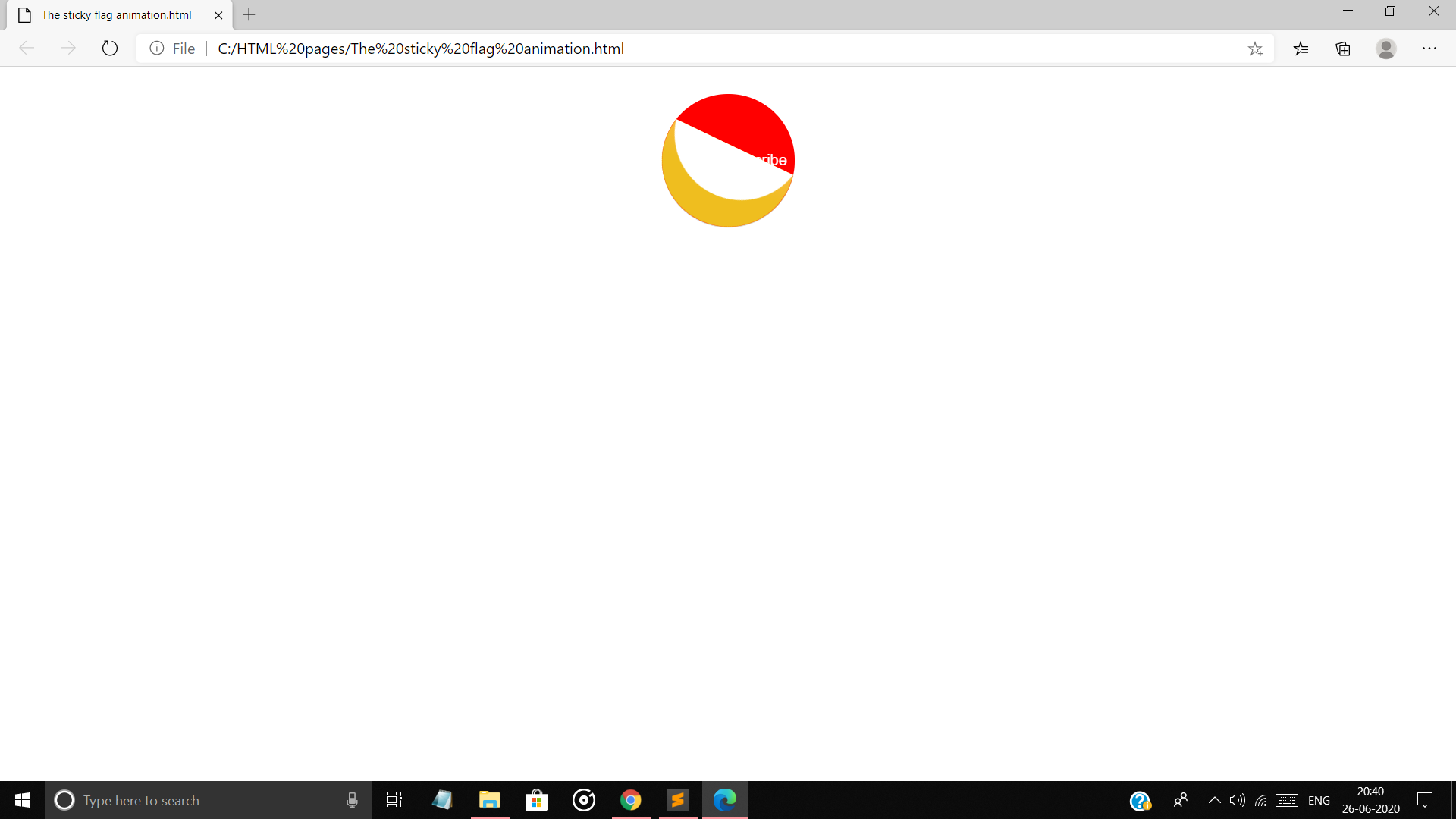
Here is the new animation of the sticky like flag. When the mouse is close or on the object, the flag flip and flop with hover effect and display the text in it.
Try once the code and stay loving codoblog...Happy here.
CODE -
<html>
<head>
<style type="text/css">
.animation{
transition:all 750ms ease-in-out;
}
#Awesome{
position: relative;
width: 180px;
height: 180px;
margin: 0 auto;
backface-visibility:hidden;
}
#Awesome .sticky{
transform:rotate(45deg);
}
#Awesome:hover .sticky{
transform:rotate(10deg);
}
#Awesome .sticky{
position: absolute;
top: 0;
left: 0;
width: 180px;
height: 180px;
}
#Awesome .reveal .circle{
box-shadow: 0 1px 0px rgba(0,0,0,.15);
font-family: 'helvetica neue',arial;
font-weight: 200;
line-height: 140px;
text-align: center;
cursor: pointer;
}
#Awesome .reveal .circle{
background: red;
}
#Awesome .circle_wrapper{
position: absolute;
height: 180px;
width: 180px;
left: 0px;
top: 0px;
overflow: hidden;
}
#Awesome .circle{
position: absolute;
width: 140px;
height: 140px;
margin: 20px;
border-radius: 999px;
}
#Awesome .back{
height: 90px;
top: 30px;
}
#Awesome:hover .back{
height: 90px;
top: 110px;
}
#Awesome .back .circle{
margin-top: -130px;
background-color: white;
background-image: -webkit-linear-gradient(bottom,rgba(252,236,63,.0),rgba(255,255,255,.8));
}
#Awesome:hover .back .circle{
margin-top: -50px;
}
#Awesome .front{
height: 150px;
bottom: 0;
top: auto;
-webkit-box-shadow : 0 -140px 20px -140px rgba(0,0,0,.3);
}
#Awesome:hover .front{
height: 70px;
-webkit-box-shadow : 0 -60px 10px -60px rgba(0,0,0,.1);
}
#Awesome .front .circle{
margin-top: -10px;
background: orange;
background-image: -webkit-linear-gradient(bottom,rgba(251,136,63,.0) 75% ,#f7bb37 95%);
background-image: -moz-linear-gradient(bottom,rgba(251,236,63,.0)75%, #f7bb37 95%);
background-image: linear-gradient(bottom,rgba(251,236,63,.0)75%, #f7bb37 95%);
}
#Awesome h4{
font-family: 'helvetica neue',arial;
font-weight: 200;
text-align: center;
position: absolute;
color: white;
width: 180px;
height: 140px;
line-height: 140px;
transition:opacity 50ms linear 400ms;
}
#Awesome:hover h4{
opacity: 0;
transition:opacity 50ms linear 300ms;
}
#Awesome:hover .front .circle{
margin-top: -90px;
background-color: #e2d439;
background-position: 0 100px;
}
</style>
</head>
<body>
<div id="Awesome" class="animation">
<div class="reveal circle_wrapper">
<div class="circle" style="color:white"> Please Subscribe</div>
</div>
<div class="sticky animation">
<div class="front circle_wrapper animation">
<div class="circle animation"></div>
</div>
</div>
<h4>CodoBlog</h4>
<div class="sticky animation">
<div class="back circle_wrapper animation">
<div class="circle animation"></div>
</div>
</div>
</div>
</body>
</html>
OUTPUT -
1. After run the project

2. When the mouse pointer crosses object

3. With the Hover Effect
So, Let's try the code and stay loving it..😊😊😊😊
Watch video if geting some problem.
Comments
Post a Comment