
The PUBG Show

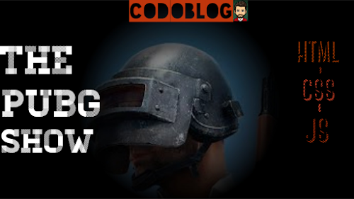
The Pubg Show | Code for Pubg | For the Pubg Lovers..


Hey everyone..! This is the code about the Pubg background and the hover hide animation. You will able to design the code for pubg show. If you are the coder and pubg lover, then you must have to w try to do the code.

#CODE :

<!DOCTYPE html> <html> <head> <title>For PUBG Lovers</title> <script src="https://code.jquery.com/jquery-3.4.1.js"></script> <script type="text/javascript"> window.addEventListener("load",function(){ const loader = document.querySelector(".loader"); loader.className += " hidden"; }); $(document).ready(function(){ $("body").show(); $(".screen").hide(); $(document).mousemove(function(e){ $(".screen").show() $(".circle").css('background','radial-gradient(circle at '+e.pageX+'px '+e.pageY+'px,transparent,#000 40%)') }) }); </script> <style type="text/css"> body{ margin: 0; padding: 0; background-color: black; width: 100%; height: 100%; } .screen{ position: relative; height: 100vh; background:url( "https://encrypted-tbn0.gstatic.com/images?q=tbn%3AANd9GcTU-KMyzAVPj0L6JmzfwWqhU3M1eWHOWR2gj-mQhVVVPKQ-BIML"); background-size: 100%; background-repeat: no-repeat; } .circle{ position: absolute; width: 100%; height: 100%; } .loader{ position: fixed; width: 100%; height: 100%; z-index: 99; display: flex; background-color: #fff; justify-content: center; align-items: center; } .loader.hidden{ animation: fadeOut 1.5s; animation-fill-mode: forwards; } @keyframes fadeOut{ 100%{ opacity: 0; visibility: hidden; } } #text{ margin: 80px; font-weight: bolder; color: #173945; font-size: 50px; text-align: center; text-transform: uppercase; } </style> </head> <body onclick="pubgsong()"> <audio id="music" autoplay> <source src= "https://drive.google.com/uc?id=171npf_S1MHsaqXJJwA5AjSICENu94FT6" type="audio/mp3"> </audio> <script type="text/javascript"> var music = document.getElementById("music"); function pubgsong() { music.play(); } </script> <div class="loader"> <p id="text">Loading...</p> </div> <div class="screen"> <div class="circle"></div> </div> </body> </html>


#OUTPUT :


Comments

The Most Populer

Random Captcha Generator

 How to generate random captcha || JAVASCRIPT techinc Here, you will going to teach how to generate random captcha by javascript #CODE: <!DOCTYPE html>     <html>         <head>             <title></title>         </head>         <body>             <canvas width=150 height=70 style="border:1px solid black;"></canvas><br>             <button style="width:150px;             height:40px;             color: red;             -webkit-tap-highlight-color:rgba(0,0,0,0);" onclick="generateCaptcha()">Generate Captcha</button>             <style type="text/css">                 body{     ...

The World Map

The World Map Here is the code of Designing the WORLD MAP by using Html-Css-Js only.Google Map provide you the option that is Map for Developer. So, CodoBlog provide you the code for how to design the map. CODE -     <!DOCTYPE html> <html> <head> <meta charset="UTF-8">     <meta name="viewport" content="width=device-width, initial-scale=1.0">     <link href='https://api.mapbox.com/mapbox-gl-js/v1.8.1/mapbox-gl.css' rel='stylesheet'/>     <link rel="stylesheet" type="text/css" href=""> <title>The World Map</title> <style> *{ margin: 0; padding: 0; } #map{ width: 100vw; height: 100vh; } </style> </head> <body> <div id='map'></div> </body> <script src='https://api.mapbox.com/mapbox-gl-js/v1.8.1/mapbox-gl.js'></script> <script> mapboxgl.accessTok...

Code for icon design | camera icon code | html-css code

 Camera ICON creation || Code for the camera icon  Here is the code for camera icon design..try with your efforts..! ICON #CODE : >>                <!DOCTYPE html> <html> <head> <title>Camera Icon Creation</title> <style type="text/css"> body{ margin:0; background-color: lightblue; } .outer{     width: 50%;     height: 100vh;     display: flex;     justify-content: center;     align-items: center;     margin: 0 auto; } .body{     background-color: white;     border-radius: 30%;     width: 11rem;     height: 11rem;     position: relative;     box-shadow: 1px 1px 6px 1px slategrey; } .red{     border-radius: 50%;     background-color: crimson;     width: 10px;     height: 10px;     position: absolute;     ...